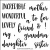
Wonderful Women - Distress Ink Blending Tips
Hi everyone! I hope you are having a great week! I am enjoying spring break with my hubby and kiddos. I thought it was the perfect time to bring you a quick and easy springy project. I'll be using the Wonderful Women stamp set and Bouquet Die from Concord & 9th. I used these products just a week or so ago...and thought it would be fun to show another way to use them.
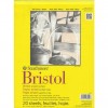
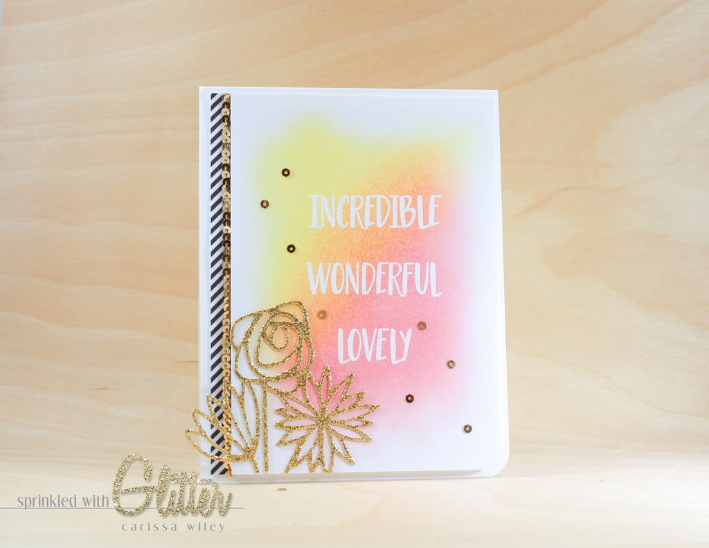
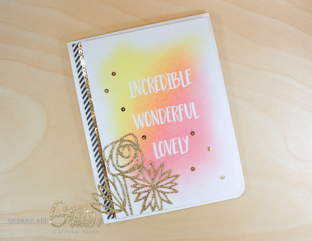
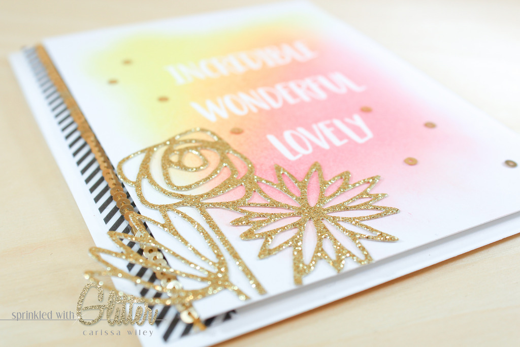
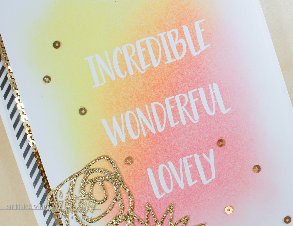
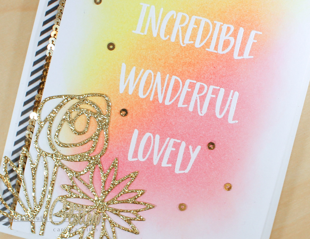
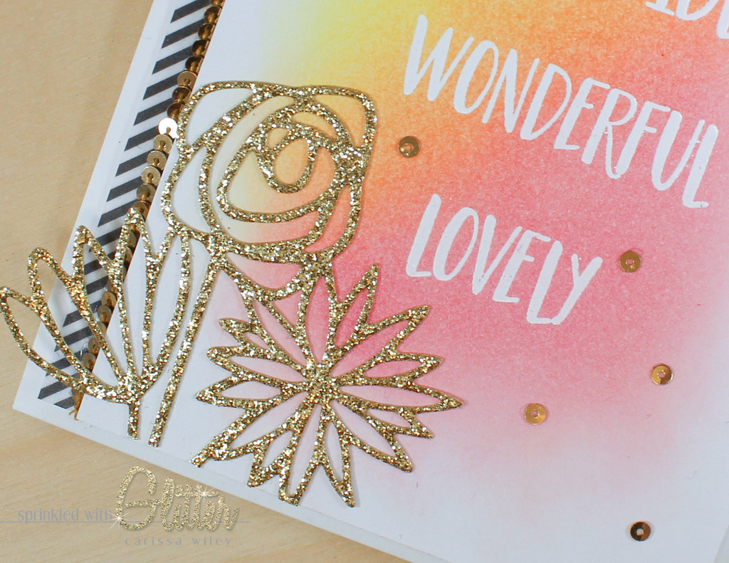
I started by white heat embossing the Incredible, Wonderful, Lovely words on some smooth Bristol card stock. I knew I wanted to do some emboss resist with Distress Ink blending and I've found that I get much smoother blending results when using the smooth bristol. It's a tip I picked up from my friend Julie.
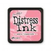
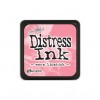
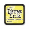
I'm using Squeezed Lemonade and Worn Lipstick Distress Ink to create a beautiful ink blended background. This color combo was inspired by a card by Yana. You can check out that video tutorial here and another one HERE. I used my ink blending tool to apply the ink to the background. I always make sure that I have a piece of scrap paper handy when I'm doing ink blending. I like to dab off the blending tool before taking it to my project. This prevents me from getting large blobs of ink. It also keeps me from getting the color too intense off the bat. I can always build color and add more, but it can't be taken away.
When blending the ink on to the background, I also like to make sure that I'm using the lightest pressure possible. This gives much smoother results. As I mentioned before, it's easier to add color...but you can't take it away. This light pressure is another strategy for preventing blobs of ink and getting much smoother results.
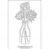
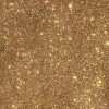
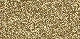
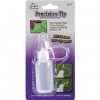
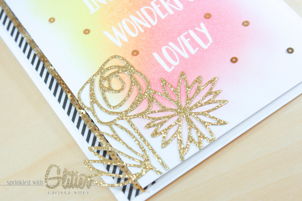
Once my panel was created, I added some flowers cut from gold glitter card stock. I haven't used gold glitter card stock in a while, so I figured it was time to resurrect it! I used the Bouquet Die from Concord & 9th. To get a nice clean cut with the glitter card stock, I used the Precision Base Plate from Sizzix. If you don't have the Precision Base Plate, you can try adding a shim instead. I then applied to sparkly die cut flowers to my card front. I allowed the flowers to hang off the left edge of the card. Love those sparkly flowers!
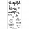
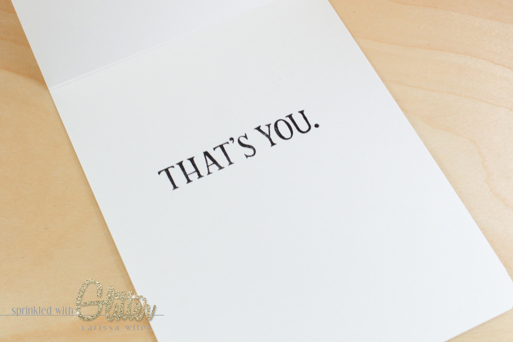
On the inside of the card, I stamped "That's You." This stamp is from the Concord & 9th Being Classy stamp set. I thought this was the perfect addition to the sentiment on the front of the card. And I love how well the fonts on both of these stamp sets coordinate. I don't usually add sentiments to the inside of my cards, but it just felt right on this card.
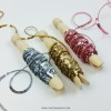
I finished the card off by adding a few more accents. I added some striped Shape N Tape along the left edge. I also added the 3mm Gold Sequin Strand from Concord & 9th with some 1/8 inch Be Creative tape. I took a few of these sequins off the strand and added them to the card front for a bit more sparkle. Lots of fun sparkle on this card!
There you have it! A very quick and easy spring inspired card. This one came together really quickly! And the results are beautiful. Love the way that yellow and pink combined to make the most beautiful blend ever!
As always, I've included a video tutorial below walking you through the entire creation of this card. I've also included links to all the products used in this project below.
Thanks for stopping by today! I hope you've enjoyed this project and I hope I've given you a few tips to make ink blending a little easier. Until next time, I hope you have a fabulous day and a very Happy Easter!
Supplies
*affiliate links used*